Introduction to Fontology
Hundreds of YouTubers and instructors teach creative design. And any AI can write great words. But very few people cover one of the most important aspects of creating great designs – how to properly choose and use the right typefaces, or fonts. Fontology is the study and practice of designing and using fonts, an essential element of visual communication.
Using fonts is a blend of art – and psychology – that plays a crucial role in effective communication. By understanding the different types of fonts and the basic principles of font usage, you will totally enhance the visual appeal, readability, and even marketability of your designs.
Whether you’re designing a website, making a t-shirt, creating stickers, or even writing an email, the right font choice can make a significant difference in how your message is received. And, not to alarm you, but the wrong font choice could send your reputation in a downward spiral that may be unrecoverable. Fontology is kind of important!
Fonts are not just about making text readable; they are responsible for 3 critical functions in design.
- Fonts can convey emotions,
- set the tone,
- and enhance the aesthetic appeal of any printed content.
Whether you’re a graphic designer, a web developer, or simply someone interested in typography, understanding fontology can improve the effectiveness of your designs. We’ll cover all that here in this video.
What is a Font?
The English word “font” comes from the French word “fonte,” which means “something that has been melted.” Before that, French FONTE came from the Latin verb “fundere,” meaning “to melt” or “to pour.” The connection to melting and pouring relates to the historical process of creating typefaces from molten lead in the early days of printing presses.
Today, a font is known as a specific style of text characters. Technically, fonts belong to larger families known as typefaces. For example, Comic Sans is a typeface, and Comic Sans Bold, Italic, and Regular are fonts within that typeface. But most people just call Comic Sans, Times New Roman, Arial, or any old typeface – a “font.”
Font Types
Fonts are categorized into several types, each with its unique characteristics and suitable use cases:
1. Serif Fonts: These fonts have little dingleberries – or small lines, dots, or strokes attached to the end of a larger stroke in a letter within a particular font family called serifs. Examples include Times New Roman and Georgia. Historically, serif fonts were used in print media due to their readability. But to be honest, I believe Sans-Serif typefaces, or fonts, are actually more readable.
2. Sans-Serif Fonts: Sans means “without,” so sans-serif fonts lack the dingleberries, or small “serifs,” at the end of strokes. Examples include Arial and Helvetica. They are considered more modern and are commonly used in digital media.
3. Script Fonts: These fonts try to copy cursive handwriting, which means anyone under 30 probably can’t read them. They can be formal (like wedding invitations) or casual (like playful, fake-handwritten notes). Examples include Brush Script and Pacifico.
4. Monospaced Fonts: In these fonts, carried over from the old typewriter days, remember those? Each character occupies the same exact amount of horizontal space, even if the letter doesn’t need it. Examples include Courier and Consolas. For whatever reason, monospaced fonts are still used in computer coding and programming environments.
5. Display Fonts: These are decorative fonts intended for use in large sizes, such as headlines and signage. They are not typically used for body text due to their elaborate design. Examples include BANGERS and Impact.
Legibility and Readability
- Legibility refers to how easily individual characters can be distinguished from one another. It is crucial for ensuring that text can be read without strain. Script fonts are notoriously confusing, especially with the letters I and L.
- Readability refers to how easily text can be read and understood. This involves choosing the right font size, line height, and letter spacing. Some fonts are too thin to be seen from a distance, or spaced too close together so they overlap. And NEVER use ALL CAPS with any script fonts!
- And what the heck is up with the double-stacked or double-story a, you know, the weird looking lower-case funny looking letter a no one ever writes? Font “professionals” consider the double-story “a” to be more readable in smaller font sizes or dense text, reducing the likelihood of confusion with similar characters like “o” or “g.” It’s also considered to be more classy. Whatever. Agree to disagree. The single-stacked a is one of the few arguments for supporting the Comic Sans typeface.
Hierarchy and Contrast
Creating a visual hierarchy helps guide the reader’s eye and emphasizes the most important elements of the text. The headline is the most important part of your text, so headlines should always be larger, bolder, and more prominent than the rest of whatever you’re printing or making. Contrast between different fonts and font sizes can help establish this hierarchy. For example, using a bold sans-serif font for headings and a regular serif font for body text can create a clear distinction between different sections.
Consistency and Alignment
Consistency in font usage ensures a cohesive look throughout the design. There’s an unwritten rule about limiting the number of fonts to two or three in any sign, shirt, or article to help maintain consistency. The fastest way to spot an amateur designer is to see 10 different fonts on one sticker, sign, or t-shirt. No. Just no.
The alignment of text enhances readability and gives the design a clean, organized appearance. In the biz, it’s known as justification. Left justification (“ragged right”) is the most common alignment in English, followed by centered justification for a more balanced or symmetrical look.
Printed articles tend to use full or forced justification to align text to both the left and right margins. It only works with certain fonts. Trust me, due to its awkward forced spacing, this almost NEVER looks good in any creative design.
Choosing the Right Font
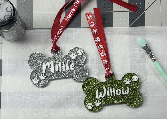
Here’s where things get sketchy. Whether you consciously realize it or not, you are probably striving for a certain “feel” when you create crafty artistic creations. Maybe you’re making an inspirational sign. Or a funny ornament. Or a sarcastic sticker. Or maybe even a memorial for a lost pet. Since we mentioned certain fonts can convey feelings and emotions, you’ll need to choose the right typeface, or font, for your project.
- Consider the purpose of your design. For formal designs, a serif font might be appropriate. A script font or maybe a display font may be better for silly, fun things.
- Think about your audience’s preferences. Older folks might prefer larger, bolder, more legible fonts, while a younger audience might appreciate trendy, unique typefaces. Color is important too – remember that some people can’t see the colors red or green very clearly.
- The context in which the font will be used also matters. For instance, display fonts are ideal for headlines and posters but not for a memorial about great-grandma’s legacy.
Pairing Fonts
Effective font pairing involves combining fonts that complement each other. A common strategy is to pair a serif font with a sans-serif font to create a balanced contrast. Tools like Google Fonts, FontPair, and many AI websites can help you find font combinations that some folks think work well together. Font pairings are highly subjective, so don’t take them as gospel.
For example, we used an AI to scour the interwebs and it found these supposedly perfect free Google font pairings.
Classic and Elegant
Times New Roman (Serif) & Arial (Sans-Serif)
Modern and Clean
Montserrat (Sans-Serif) & Open Sans (Sans-Serif)
Playful and Friendly
Merriweather (Serif) & Lexend (Sans-Serif)
Creative and Artistic
Lobster (Display) & Roboto (Sans-Serif)
Warm and Inviting
Lora (Serif) & Nunito (Sans-Serif)
Fontology: Tone and Emotion
Although we’re all different, and you may not realize it, the font you use in your design may convey a certain tone or invoke a certain emotion in someone else. And you don’t want that tone and emotion to be the wrong tone or emotion.
Serif fonts are more aligned with formal messages, trust and reliability, and class and sophistication. You might use a serif font to communicate recognition to engrave or print an award, or a more formal sign or address.
Sans-serif are less formal, more modern, friendly, and simplistic. Think product packaging, inspirational messages, snarky stickers, or fun t-shirts.
Examples of Great (and Not So Great) Fontology
Amateur designers, especially Alexa in accounting or Evan in engineering, you know, those left brain types, should NEVER be set free to create ANYTHING that the outside world may see. Our video shows a few clear examples of fonts-gone-wild.
Font Licensing and Usage
It’s important to understand font licensing. You can’t just download a font and use it willy-nilly wherever you want, and especially if you plan to sell your creations!
Many fonts are free for personal use, meaning if you’re making yourself or your buddy a few t-shirts, signs, or stickers, and you’re not selling them, you’re probably fine. If you plan to sell them, you’ll probably need to purchase a commercial license.
Some fonts require a license for any use. Always check the licensing terms before using a font in your commercial project. Font licenses can run anywhere from free to thousands of dollars per font.
Wrap Up
Wondering why that remembrance mug with the Comic Sans font isn’t selling like hotcakes? By understanding the basics of fontology, you can improve your design skills and create visually compelling art that correctly captures your desired audience’s attention. It’s basically common sense. Now get to it! Happy designing!